Data visualization sits at the heart of compelling data storytelling. Clear charts and thoughtfully designed figures are often the difference between insights that resonate with our audience or something that is just noise and gets no interests. As my PhD advisor reminded many times, the highest quality visualizations speak for themselves, they should be clear and intuitive that words are not needed.
In this article, I’ll share practical tips and tricks for choosing the right types of plots for different kinds of data. With the right approach, your visualizations won’t just display information, they’ll provide insights and tell a story.
Step 1: Understand your data
Before choosing a plot, take a moment to understand the structure and goal of your data.
- Is it categorical (e.g. South Region, Central Region, North Region or Jan, Feb, March) or numerical (e.g. 1,1.1,6.5, 7.8)
- Does it go overtime or across groups?
- Do you want to highlight trends over time, compare different groups, see relationships between two variables, or overall compositions
Once you understand what you are working with, selecting the right plot becomes much easier.
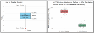
Boxplots: Boxplots are another great way to compare categories especially when you are trying to understand the distribution, spread and potential outliers of numerical variables. While boxplots are a little more complicated to read, they are simple to understand. Below is a figure highlighting how to read a boxplot. For more information on distribution and summary statistics read my previous post. Some examples useful for boxplots are:
- Looking at the distribution of daily precipitation for each month of the year
- Looking at the distribution of ATP counts before and after cleaning and sanitation
Goal: Trends over time
Line Charts: When you have chronological data line charts can reveal patterns or seasonality easily. They are great for tracking change over time and spotting times of interest. Some examples of effective use include
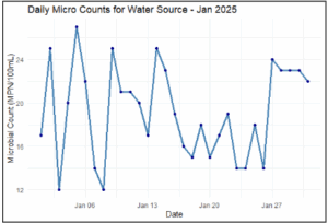
- Daily tackling: plotting your daily micro counts for a water source
- Long term tracking: tracking your annual positivity rate for two different locations throughout the year.
Goal: Show Distributions
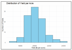
Histograms and Boxplots: To explore how values spread, peak, or skew, histograms display frequency while boxplots condense that story into quartiles and outliers. Together, they give both intuitive and statistical perspectives. Histograms specially can provide you with the distribution of continuous numerical data where the continuous numerical data gets split into bins, and the y-axis tells you the frequency for these bins. Some examples of using histograms include:
- Examining the frequency of yield per acre for your fields
Goal: Show Relationships
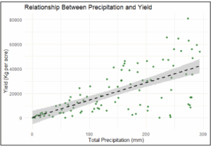
Scatterplots: When you need to assess the correlation, or lack thereof, between two numerical variables, scatter plots are the go-to plot. In addition, you can add a trend line to make direction and strength clear. Examples of effective use:
Correlation: plotting total precipitation vs yield to demonstrate positive association between precipitation and yield
Outliers: could show areas that are out of the norm (low yield even though precipitation was high)
Clusters: Potentially show areas where precipitation is high, but UV is low therefore yield may follow a different pattern
Goal: Showing parts of a whole
Stacked Bar charts or 100% stacked charts: These shows can give a sense of how different categories make up a whole. Come examples can be.
- Total Availability of Fruits and Vegetables that come from domestic vs foreign origin
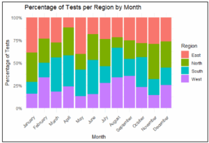
- Percentage of tests per region per time of the year.