

Have you ever heard the saying “data does not lie, people do”? The saying captures a real challenge in data analysis: numbers do not interpret themselves. People decide what to measure, how to clean the data, which methods to use, and how to present the results. Those choices can shape the conclusions just as much as the data themselves.
Data are simply observations, the challenge begins when people decide how to analyze, interpret, and present those observations. Those decisions can lead to very different conclusions, even when everyone starts with the exact same dataset. This is an important distinction, because not all differences in analysis are inappropriate. Some show reasonable scientific judgment, while others cross the line into selective interpretation, incomplete context, or analytical choices that push the data toward a preferred conclusion. Understanding that difference is essential.
One of the clearest examples of this comes from a well-known project called the “Many Analysts, One Data Set” study. In that project, 29 research teams, producing 61 separate analyses, were given the same dataset and the same research question: did a player’s skin tone influence the likelihood of receiving a red card from a referee? Even though every team worked from identical data, they made different analytical choices. They used different statistical models, selected different variables, and applied different assumptions. The result showed wide variability of the importance of the skin tone variable, with 69% of the team finding a positive association, and 31% of the team finding no association at all.
The important point is that most of these analyses were not “wrong.” There were different, but still reasonable, ways of approaching the same problem. What the study showed is that analytical choices matter. The path an analyst takes through a dataset can shape the story that emerges from it.
Bias as Part of Analysis
Bias in data analysis does not always mean manipulation or bad intent. More often, it comes from a series of ordinary decisions made throughout the analytical process. As shown in the above example, analysts decide how to clean the data, which variables to include, which statistical model to use, how to handle missing values, how to define categories, or which subset of data to analyze. Each decision may be justified on its own, but together they influence the result.
For example, two analysts working with the same food safety data might make different decisions about how to group samples, how to treat outliers, or whether to adjust for seasonal factors. These decisions can shift estimates, alter statistical significance, or highlight different relationships within the data. This flexibility in analysis is sometimes referred to as “researcher degrees of freedom.” The more analytical choices available, the greater the potential for results to vary across analysts.
This type of variation is not necessarily a problem. In many cases, it is an unavoidable part of the scientific process. The key is that these decisions should be transparent, justified, and grounded in research.
When Bias Crosses the Line
Not all bias in data analysis is harmless. Some differences in approach reflect legitimate scientific judgment, but others cross the line into practices that distort the evidence and create a misleading picture of what the data actually show. The issue arises when choices are made not because they are scientifically justified, but because they move the analysis toward a preferred conclusion.
This can take several forms. One example is p-hacking, where many analyses are tried and only the statistically significant result is reported, or where the data are manipulated in ways that create the appearance of significance. Another is selective reporting, where results that support a preferred conclusion are emphasized while null or conflicting findings are ignored. A related issue is data dredging or fishing, where large datasets are searched until an interesting pattern appears, even if that pattern may simply be due to chance. IBM has a great article in bias, for those interested in learning more.
These practices may produce conclusions that look rigorous on the surface, but they overstate confidence and make weak relationships appear stronger than they really are. Unacceptable “not ok” bias happens when decisions are hidden, manipulated, or driven by the desire to produce a more compelling result rather than a more accurate one.
Examples of Misleading Data Use
A peer-reviewed article published in 2025 evaluated 341 studies using NHANES data to examine associations with health outcomes. The review found recurring signs of problematic analytical flexibility, including selective use of survey years or cohort subsets without clear justification, patterns consistent with data dredging, and evidence of post-hoc hypothesis formation. The real lesson is that large, flexible datasets can easily generate misleading findings when researchers are not disciplined and transparent about how analyses are conducted.
Another example comes from the recent discussion around PFAS pesticides in California fresh produce. In 2026, EWG used, 2023 California residue monitoring data to claim that nearly 40% of non-organic California-grown produce was contaminated with PFAS pesticides. But the issue was not simply whether residues were detected. A more complete reading of the same data shows that the residues highlighted in the article were, on average, only about 7% of the applicable EPA tolerance levels (Figure 1), meaning the presence of a detectable residue did not by itself indicate a meaningful health risk.
That context matters because EPA tolerances are not arbitrary thresholds. They are regulatory established through risk assessment and designed with conservative safety margins. Just as important, pesticide risk is not evaluated based on detection alone, but through exposure assessment that considers dose, and cumulative safety frameworks. By emphasizing the percentage of samples with detectable residues while giving much less attention to residue magnitude, tolerances, and cumulative exposure context, the article presented a different more targeted interpretation.
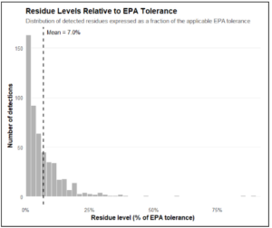
Figure 1: Residue levels relative to EPA tolerance for detected samples. Although residues were detected, their levels were generally low, averaging only about 7% of the applicable EPA tolerance.
What Responsible Data Use Looks Like
The responsible way to analyze data is not to pretend that analysis can ever be completely free of judgment. Rather, it is to make that judgment visible. Good analysis should clearly document and explain how data was cleaned, which assumptions were made, why certain variables were included, and whether alternative analytical approaches were considered. When multiple reasonable choices exist, analysts should be willing to show how the results change under different assumptions rather than presenting a single interpretation as if it were inevitable.
IBM has emphasized (in the referenced article) the importance of understanding how data are collected, interpreted, and communicated. In practice, reducing bias means being transparent about methods, clearly defining hypotheses in advance when possible, reporting alternative analyses, testing how sensitive results are to key assumptions, and presenting findings in their full scientific and regulatory context. These strategies help separate legitimate interpretation from selective storytelling.