Food safety programs collect a lot of information. Samples are taken, records are filled out, results are reviewed, and reports are filed. Yet one of the most common challenges across the industry is not a lack of data, it is knowing what that data is telling us and how to interpret it.
This is where trend analysis becomes valuable. Rather than focusing on individual results, trend analysis helps us understand how a system behaves over time. Trend analysis is the practice of looking at data across time and context to understand how a system is behaving, rather than focusing on individual results in isolation. It helps turn routine records into insightful datasets.
Why do we need to look at trends?
Food safety data naturally changes from day to day. Activities outside of your control are always changing: weather shifts, production volumes, human intervention, animal activity. We live in a dynamic environment. Because of this, variation in results is expected, even in well-managed programs. When data is reviewed one result at a time, it can be difficult to tell whether a change is meaningful (requires an action) or simply part of normal variability for a naturally variable system.
By looking at patterns instead of isolated outcomes, we can gain a clearer picture of performance/behavior.
What trend analysis really is
In simple terms, trend analysis is a way of organizing and viewing data so patterns become visible.
This often involves:
- Looking at results/observations in chronological order
- Grouping data by area, season, practice, etc.
- Comparing results/observations before and after changes are made
Intentional Data Collection Makes these Trends meaningful
Trend analysis is only effective when data is collected with purpose. Data gathered solely to meet a requirement may be difficult to interpret later if it lacks consistency or context. It is about removing variables that would influence our data
Intentional data collection means:
- Sampling the same locations or activities consistently
- Using similar/equivalent methods for collecting, testing, observing data over time
- Recording enough background information to understand what was happening when data was collected.
How to visualize Trends and What to Look For
Trend analysis is about creating visualizations that are useful, but more important is learning how to read what you see. Not every rise, dip, or unusual point means something is wrong. Trend analysis helps distinguish between normal fluctuation and patterns that deserve attention.
The examples below illustrate common ways food safety teams visualize data and what those visuals can reveal.
Looking at Results Over Time
One of the most common visuals is a simple timeline showing results in the order they were collected. This allows teams to see how results move over days, weeks, or months.
What this helps reveal:
- Whether results stay within a consistent range
- Whether values gradually increase or decrease
- Whether clusters appear during certain periods
A single high or low result may simply reflect normal variability. However, a consistent upward shift or repeated elevations can suggest a change in conditions that may warrant closer review.
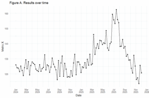
Basic Trend Plot: Plotting results over time shows that results naturally move up and down, but it also makes it easier to spot when the overall pattern changes.
- What to look for: Is the line “bouncing around” within a familiar range (normal variation), or does it begin staying higher/lower for an extended period (a possible shift)?
- Why it matters: Seeing data as a sequence helps avoid overreacting to single points and supports better decisions about when to investigate. In the data below we may consider the peak in May through September as an anomaly.
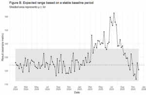
Setting up what you expect: Setting up what you expect means setting up a baseline. In this case we could use the historical data (from Jan 2024- End of December 2024) to set up our baseline and determine what is “not normal.” Figure B adds a shaded area that represents the range of results typically observed during a baseline period, when the system was believed to be operating normally.
The shaded area is calculated using a standard Statistical Process Control (SPC) approach:
Expected range = baseline mean ± 3 × baseline standard deviation (μ ± 3σ)[1]
This formula is used because, in a stable process, most routine variation falls close to the average. Values more than three standard deviations away from the mean are considered uncommon and therefore treated as a signal worth reviewing, rather than normal background noise. However, it is also important to understand what our short-term trend is telling us (Figure C)
What to look for
Occasional points outside the shaded area can happen. However, repeated or sustained points outside this range suggest the system may be behaving differently than it did during the baseline period.
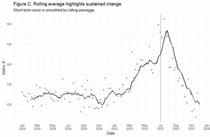
Smoothing short term changes: Another approach would be to apply a rolling average to the same data (in the case of figure 6, the previous 6 data points), this rolling average smooths short-term ups and downs while preserving longer-term behavior.
What to look for: If the smoothed line gradually shifts and remains elevated (or depressed), this is often more meaningful than a single spike. The rolling average helps confirm whether a change is persistent, rather than random.
Why it matters: This view supports thoughtful responses by reducing “false alarms” and helping us focus on sustained patterns rather than individual data points. Having insights into what may have happened during this time period may help define if this is expected or not.
Figure C: The rolling average smooths out short-term ups and downs, making it easier to see a sustained rise in results during mid-2025 rather than isolated spikes. The gradual decline later in the year shows how the system returned toward its earlier range, helping distinguish temporary noise from meaningful patterns.
Conclusion:
Trend analysis is not about reacting to every fluctuation. It is about learning what is normal for a system and recognizing when patterns begin to change in meaningful ways. When food safety data is collected intentionally, visualized thoughtfully, and reviewed over time, it becomes insights.
The examples shown here represent introductory ways to look at trends. There are more advanced and sophisticated methods available, particularly for large or complex datasets. However, even simple visual approaches can provide valuable understanding when they are applied consistently and interpreted in context.
By focusing on patterns rather than individual results, food safety programs can reduce unnecessary reactions, support better decision-making, and build confidence that actions are driven by evidence. Developing this foundational understanding is often the first step toward more advanced data use
[1] https://cf.son.umaryland.edu/NRSG795/V2/module11/subtopic5.htm
 Environmental monitoring is a critical and nuanced field that deserves lingering on and discussing how we can squeeze even more value from the effort (and dollars!).